(INFOGRAPHIC) Do's, Don'ts & Mobile Developments of Email Marketing
We’ve discussed common practices for email marketing and how best to appeal to your audience. Now, let's take it one step further. Once you have decided on your titles and content, let’s discuss how it will appear for your readers. With mobile overtaking desktop email interactions in 2014, it is vital to consider how your emails will appear to your mobile audience. Consider the differences across these mobile devices, and try to design your emails to better fit their needs.
Text only emails
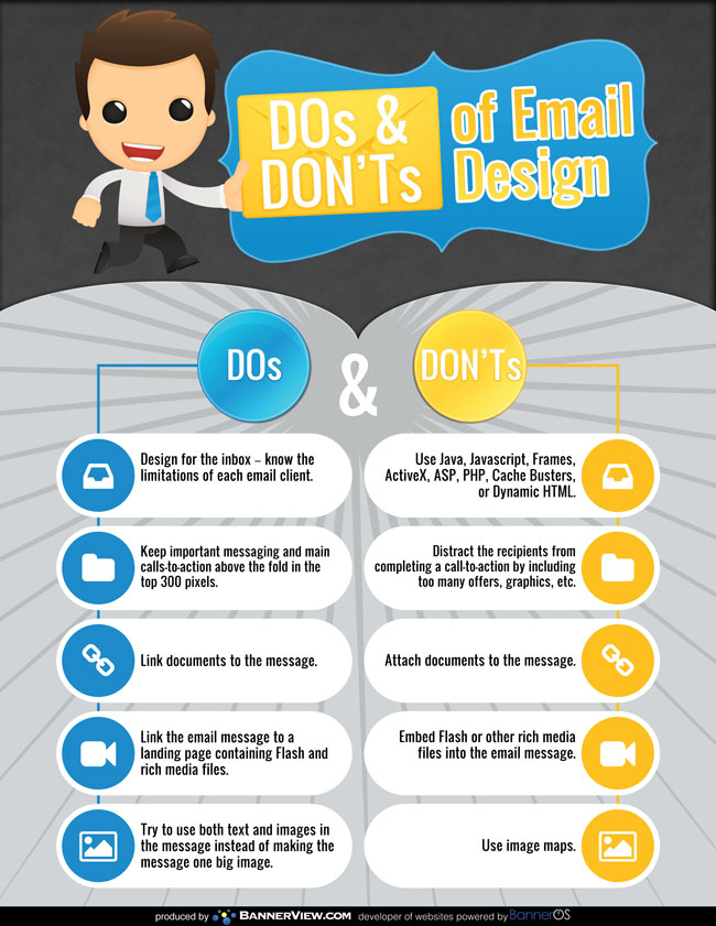
When sending out email marketing newsletters or emails including your recent blog articles make sure to include a text only version of the email. Sometimes email clients cannot open specific images or feel threatened that images are viral so your recipient isn’t able to read the full version of what you have sent out. If you are unable to give it the capability to be text only, try sending out a separate text only version of the email at a different time. This will emphasize your latest news to subscribers and is also often seen to have a higher open rate.
Responsive design
Always include a link to the full version of the newsletter or a mock version of the newsletter on your website. When subscribers are able to visit your website they’re capable of seeing your newsletter in its intended layout or design. There is no concern over how it will appear on their end because they are on your site.
"28% of consumers are hindered from engaging in email promos or newsletters because they’re not mobile optimized emails."
Try to make your website responsive no matter the means visitors are using to access the webpage. Responsive design automatically adjusts the layout to reflect the dimensions of the device being used to access the webpage. This way you can be sure the layout on their end is as intended and not simply adjusted to fit without your knowledge. Single column layouts initially look good on mobile, but they are not practical. Making users zoom in and out is not a good way to gain their loyalty. 28% of consumers are hindered from engaging in email promos or newsletters because they’re not mobile optimized emails. Don’t miss out on this market!
Layout/Design Tips
When considering mobile interactions also take into account readability. Try to implement a font between 17-22pt or larger to ensure everyone is able to read the text. Also, when implementing links keep in mind how they will look. Make the color of the text stand out so readers are able to acknowledge that the text is a link. Be sure to test these links. Bad links are one of the largest barriers to Call to action buttons work best for noticeability. Make them big and bold to get the readers’ attention.
Try to follow these guidelines when switching to a more mobile friendly email. The mobile generation is amongst us and it is very important that we meet their needs to generate traffic to our businesses.
As a benefit, please click on the image below, download the infographic and share with your friends.
Popular Articles
How to Sell Your Products on Instagram in the Instagram Marketplace
Discovering the Stonk Bin: Your Gateway to Timely Stock Tips from BannerView.com
Choose an Online Chamber of Commerce for Virtual Networking
How to Attract Attention with Social Media
Categories
Download
 Whitepapers, Infographics, & Quick Guides
What Email Campaign Schedules Generate the Most ROI?
Which Content Marketing Strategies Get the Best ROI?
Which Social Media Marketing Strategies Work Best?
Benefits of a Fully Functional & Optimized Website