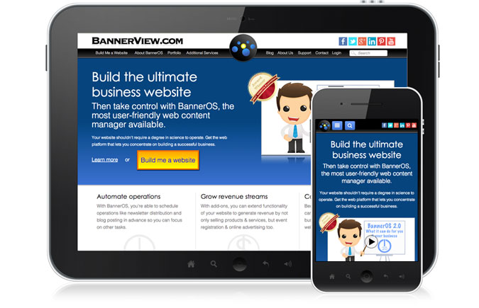
Mobile friendly makes your website matter
Customers expect to purchase & make payments online. Because of this trend, more & more business transactions are conducted through a mobile device.
One platform, one design
In the recent past, two versions of a website were designed. One a desktop, the other a mobile optimized version of your website designed to automatically detect when someone is accessing your website from a mobile device. The issue with this is that mobile just doesn't mean one size anymore. From brick, to flip phone to now smartphones in multiple sizes, one size just doesn't 'fit all.'
The better option is to get a responsive designed, mobile-friendly website. It's one website designed to adapt to the device upon which it's displayed. As technology develops and the Internet expands to automobiles, appliances, and wearable tech like watches, a website that morphs to the device used will greatly expand your reach.

We've done the research for you

Where can I learn more?
As a leader in web development programming, we try to keep up to date on trends in technology. We provide it to you as a benefit to your business. The following BannerBlog articles offer additional information on mobile technology and its use in business.
Your Non Existent Mobile Website
Chances are, your website is being visited by potential customers on their mobile devices right now. What signal are you sending? Read more
The iPad 3 Wants Tablet-Friendly Websites
Unless you've been sequestered on jury duty, you've probably heard that Apple has an event tomorrow. Whether 3 or HD, Retina Display or not, a new iPad is expected to be showcased along with "just one more thing" (if Tim Cook carries on the tradition). Read more
Hey Small Business Owner, Your Own Mobile App is Sexy, but Probably a Waste of Time and Money. There's a Better Alternative
A mobile-friendly version of your website is an affordable way to reach this significantly growing market, position your business to be more successful and keep you at the leading edge of technology. Read more
